
Workflow · 9 min read
How to create a great Windows app icon: a step-by-step guide
An application icon is seen dozens of times a day at 16 pixels and once in a while at 256. Designing for both is the whole craft. Here is a workflow that works, using IconEditor.
The workflow
Six steps from idea to app.ico
-
01
Start with one strong shape
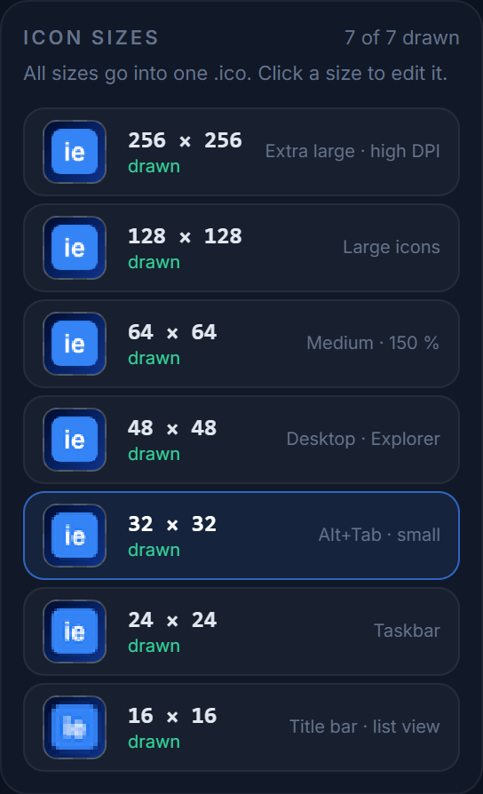
The size list shows every entry side by side — a good shape still reads in the 16 px thumbnail. Pick a single silhouette that reads at a glance — a letter, a simple object, a geometric mark. Avoid photographic detail, thin outlines and text longer than two characters. Ask: would I recognise this as a 16×16 blob on a dark taskbar?
-
02
Draw the 256×256 first
Open the editor, select 256×256 and draw the master version. Use the Line, Rectangle and Ellipse tools with a large diameter for clean geometry, the Brush with hardness below 100 for soft shading, and Fill for flat areas. Hold Shift while dragging a rectangle or ellipse to keep it square.
Keep about 8–10 % padding around the artwork. Windows never adds its own margin, and a shape that touches the edge looks cramped next to system icons.
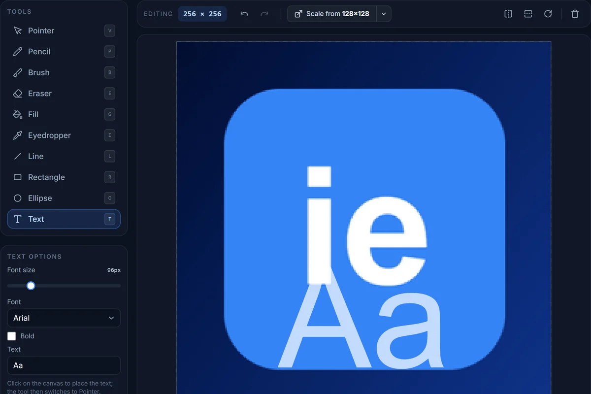
The 256×256 master. The tool list on the left has a keyboard shortcut per tool; the options panel changes with the tool. -
03
Scale down, then fix by hand
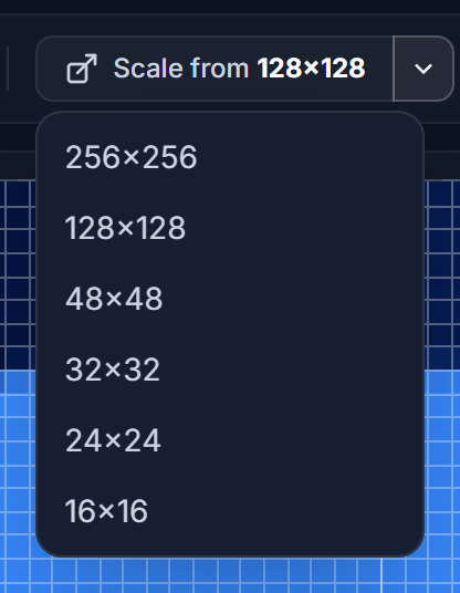
Scale from lists every drawn size as a possible source. Select 48×48 and click Scale from 256×256 above the canvas. The editor resamples with a Lanczos filter, which is as good as automatic scaling gets — but at 32, 24 and especially 16 pixels, automatic scaling always leaves blurry edges. Turn on the grid, zoom in, and:
- Snap important edges to whole pixels with the Pencil; a 1-px line that straddles two pixels looks grey and soft.
- Simplify: drop inner details, thicken strokes to at least 2 px at 32 and 1–2 px at 16.
- Increase contrast slightly at small sizes; tiny icons lose saturation visually.
- Use the Eyedropper to pick colours from the large version so the set stays consistent.
-
04
Check every context
Click Preview on Windows. The dialog shows the icon in a dark taskbar, on a desktop wallpaper, in Explorer's list and large-icon views, in a window title bar and in a browser tab. Common problems this catches:
- Dark artwork disappearing on the dark taskbar — add a light outline or a lighter base shape.
- Semi-transparent edges going muddy on the wallpaper — tighten the alpha of edge pixels at 16 and 24 px.
- Text becoming unreadable — replace it with a shape below 32 px.
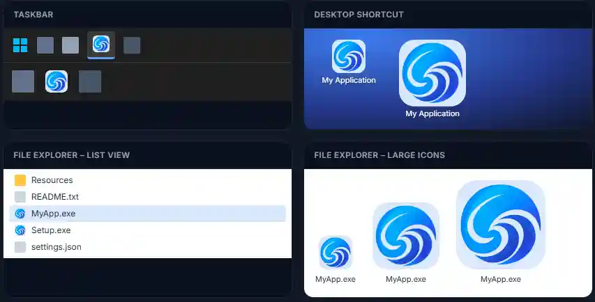
Each mock-up uses the entry Windows would pick — 24 px on the taskbar, 16 px in the list view, 48 px on the desktop. -
05
Export
Export writes a single
.icocontaining every size you selected. The 256 entry is PNG-compressed (as Windows expects since Vista), the smaller ones are 32-bit BMPs with alpha. Sizes you did not draw are filled automatically from the nearest larger one, so the file is always complete. You can also download the current size as PNG, or a ZIP of all sizes for a store listing or an installer.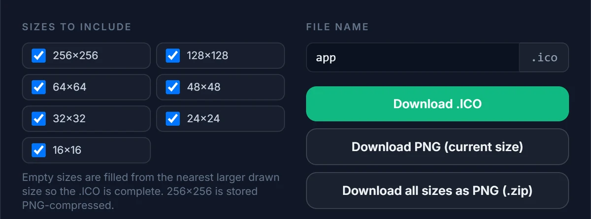
-
06
Wire it into your application
The export dialog includes copy-ready snippets:
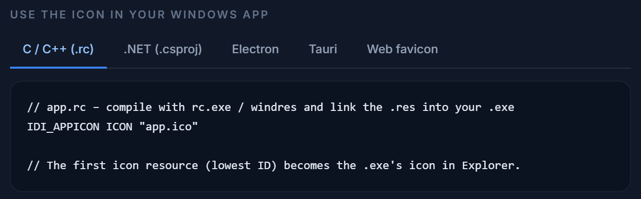
- C / C++ — an
ICONstatement in your.rcfile; the lowest-numbered icon resource becomes the executable's icon. - .NET —
<ApplicationIcon>in the.csproj, plusIcon="…"on a WPF window. - Electron —
build.win.iconfor electron-builder and theiconoption ofBrowserWindow. - Tauri —
bundle.iconintauri.conf.json.
After replacing an icon, Windows may keep showing the old one from its icon cache. Rebuilding the executable with a different file size, or clearing the cache (
ie4uinit.exe -show), fixes that. - C / C++ — an
Avoid
Common mistakes
Four things that make an otherwise good icon look wrong somewhere in Windows.
-
A PNG renamed to .ico
Shipping a single 256 px PNG renamed to
.ico. It works in some places and looks blurry everywhere else. -
No 16 and 24 px
Explorer list view and the taskbar’s small mode use them constantly — forgetting them means a blurry downscale where people look most.
-
Full-icon gradients
They turn into a smear at 16 px. Use gradients on large areas only, and flatten them in the small sizes.
-
Baked-in drop shadows
Windows composites icons over many backgrounds; a baked shadow looks wrong on most of them.
Try it as you read
The editor is free, needs no account, and exports a Windows-ready .ico with all seven sizes.